So I've been working over the last couple of days on upping the design game so its easier to understand when showing to other people. Below, the Balloon was the alternative to the globe because Im not sure I like the globe a the loading screen.


I started of with the jungle. We decided up and down was the way to go for scrolling we kind of already decided to do this earlier I just forgot to mention that). I first tried cutting everything out from differing textures. I really liked this idea. We got this kind of design aesthetic from some of our earlier inspiration pictures.

I then added animals and a human, though I think we will be scrapping the human and maybe personifying the Balloon. I also included the buttons in different places in the next few pictures. Wierdly I realise now I didn't screenshot one of when the buttons were in the middle. I don't hate the buttons at the bottom so much anymore but I still think that the buttons at the top will be to hard to reach, especially for a child.


At this point I realised I hadn't included the nav bar at the bottom or whatever its called.


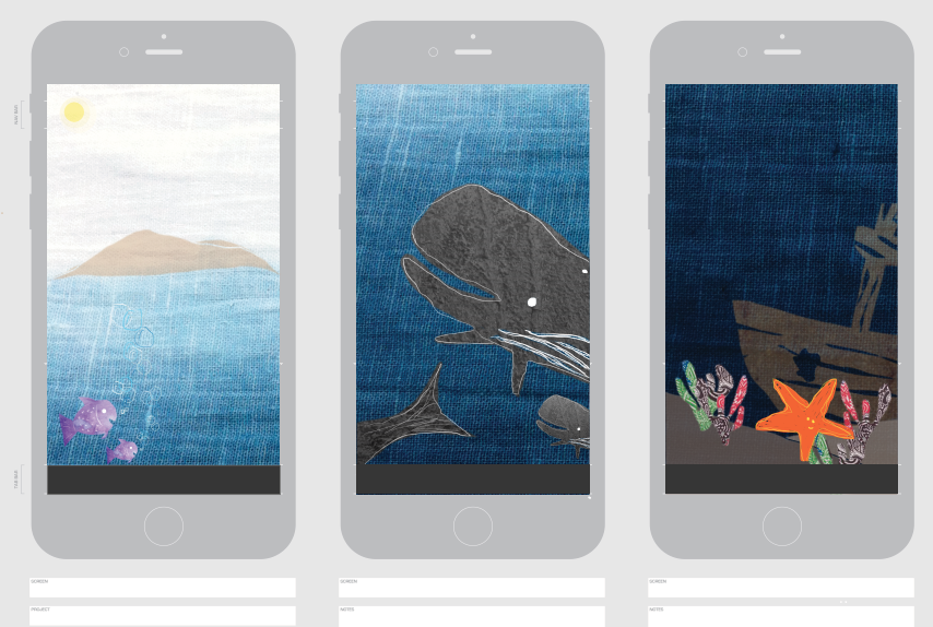
This is the beginning of the ocean/ under the sea screens. Once again I was also going for the scrolling up and down plus the texture cut out design style.

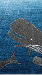

We weren't sure if we should use a Octopus or a Starfish. At the moment it looks like we will be using a starfish. I prefer it. Plus it suits being at the bottom hanging about some coral a bit more then then the octopus. And a starfish has more of a similarity with the human form then the octopus so its easier to give stretching directions by using a starfish then a octopus.


Put of these ones I think I prefer the buttons at the top. However if we moved things around it could be entirely different. We also need to remember to keep them in the same place against all three 'worlds' or locations to keep the grid happy.


Heres where I tried a different style. This time I just created shapes and used gradient to create depth and whatever. I like the hand drawn touches over the top however I think if we did this super clean without those hand drawn touches it would look awesome.


I actually did these two after the texture layout thats after this in this post. Anyways, this one was difficult in terms of the button. Obviously it cant be this wide across and will need type. Maybe readjusting of some of the the pictures. However I can see a button in the middle working out. We will see how it goes.

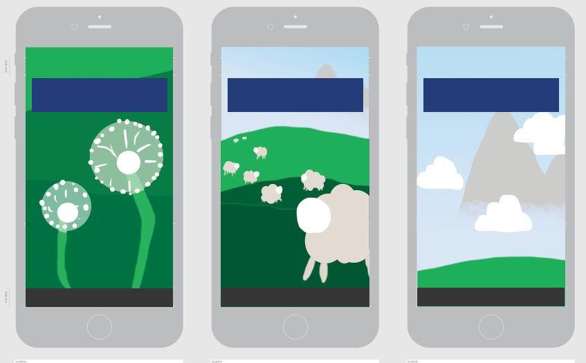
Anyways, these were the ones I did originally for the meadow. Did I mention that this one was also, of course, scrolling up and down not sideways. I think Im just better at doing the texture ones. Whereas Paige is really good with the shape ones so we will probably go with hers final wise. I think hers are probably easier for children to connect to etc. etc.


This was my attempt at the jungle in the shape style. If we had smaller buttons then I would say in the middle would be perfect (once again). Also, the snakes not great so if we could change that it would be awesome. I dont really think a snake is all that appropriate looking back but thats the only other easy to draw jungle animal i could think of at the time. We could have a tiger, but that could also be not so great or it could be awesome. Or an elephant.


No comments:
Post a Comment